Urban Market
In-Store Mobile App
My roles: UI / UX / Motion Designer, UX Researcher, Prototyping, Interaction Designer, Product Designer
Case Study:
Duration: 3 months
Project Overview
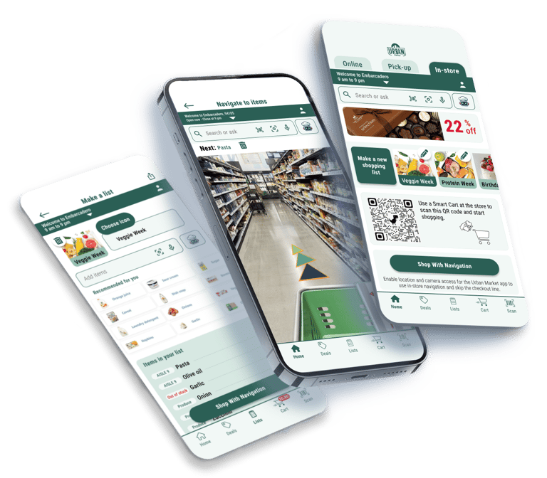
Have you ever been to a grocery store searching for an item, only to finally find it after wandering through multiple aisles? I designed an in-store grocery shopping app to enhance the experience and help customers avoid this frustration.
While online shopping offers convenience, many people still prefer visiting grocery stores to personally select items, especially fresh produce. Even frequent online shoppers often buy certain items in person, making the in-store experience a critical factor in customer satisfaction.
Through detailed research, creative problem-solving, and iterative testing, I developed solutions to make grocery shopping smoother, more efficient, and enjoyable for customers while delivering measurable value for business.
These solutions are scalable to other businesses and any retail stores with pick-up or delivery services like Target, Walmart, Amazon Fresh, or apps like Instacart. The in-store AR navigation system can help speed up the item collection process for customers or employees who gather items for customers.
Problem
After conducting user research, I realized that in-store grocery shoppers struggle to find and locate items efficiently and often experience frustration due to long checkout lines. Also, I realized some people don't know what to buy from the grocery store to make a healthy meal at home. These challenges make the overall grocery shopping experience time-consuming and unenjoyable, leading to reduced operational efficiency and lower customer satisfaction. Therefore, this project aims to address the following key challenges:
Item locating
Timely shopping list creation/population
Long checkout lines
Boring process for younger generations
Typical, unrelated offered deals
Business Objective
Increasing
User satisfaction and retention.
Sales and revenue.
Customer engagement.
Operational efficiency by reducing time on task.
Reducing
Operational costs compared to competitive stores like Amazon Fresh.
Goal
Our goal is to help in-store grocery shoppers efficiently find items and minimize checkout times by providing a user-friendly app that enhances navigation and streamlines the checkout process, improving both customer satisfaction and operational efficiency while improving key business metrics.
An In-store app for a hypothetical grocery store in San Francisco named Urban Market, which improves users' experience of in-store grocery shopping with its unique features by leveraging advanced technologies like AI and AR that introduced the following innovative solutions:
AR navigation guide for the shortest in-store routes
AI-powered visual search and shopping list assistance
App-based self-checkout
AI-powered personalized deals
AR glasses experience, allowing users to interact with the app in an immersive way, incorporating tech-driven technologies like AR and AI.


Product
Design Process
Empathize with user
Define user needs
Ideate solutions
Design and prototype solutions
Test solutions
and iterate as needed
Empathize
To better understand the grocery shopping experience, I conducted interviews with 10 adults who live in San Francisco and go to grocery stores at least a few times a year. The goal was to explore their current shopping habits, identify pain points, and uncover opportunities for improvement.
I designed key questions to identify common pain points in end-to-end in-store shopping experiences gathering unbiased feedback to inform design decisions. Here is a sample of questions I asked during interviews:
What is your biggest frustration when shopping in-store?
How do you usually find items in a grocery store? Is it easy or difficult for you?
Do you make a shopping list before going to the store? How do you keep track of it while shopping?
...


User Research
Define
Synthesizing Data
I used Affinity Diagramming to categorize the data collected from participants and identified common themes and trends to synthesize the insights, summarized in the following key findings:
Frustrations with locating items.
Spending excessive time searching for items that were suddenly moved to a different location.
Spending extra time searching for items that are out of stock.
Long checkout lines take too much time.
Don't know what groceries to buy for cooking a healthy delicious meal at home.
Grocery shopping is sometimes boring.
These findings help analyze qualitative data, guiding the design to address pain points and improve the overall in-store shopping experience. This ensures the personas are grounded in real user insights, not assumptions.
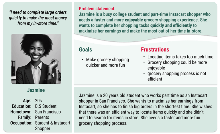
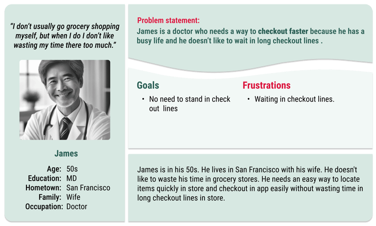
Using the insights from user research and affinity map, I defined distinct relatable user personas that guide design decisions.


How might we help customers locate items more quickly to save time during their shopping trip?
How might we streamline the checkout process for shoppers so they can have a faster and smoother experience?
How might we make in-store shopping more engaging, enjoyable, and interactive for customers?
How might we help customers create grocery shopping lists that align with their dietary goals and support healthy meal planning?
How might we make grocery shopping more accessible to people with disabilities?
Based on insights from user research and Persona's problem statements, I identified key challenges in the grocery shopping experience. These "How Might We" questions helped guide the design process, focusing on addressing these pain points and enhancing the overall user experience.
How might we provide targeted and personalized deals and offers?
Personas
Goal Statement
Putting it all together, we can define the project’s goal statement as:
Our in-store grocery app should let users locate items and checkout easier and faster which will affect users who shop in-store by helping them to populate their shopping list, navigating users to the items in the store, and letting them check out through the app. I can measure the design effectiveness by performing A/B testing and clocking time on core tasks.
Ideate


As I moved into the ideation phase to find design solutions for the identified problem statements, I conducted a competitive audit to understand how existing grocery apps address similar challenges. By analyzing features, user flows, and overall experiences of competitors like Target, Walmart, The Market, Erewhon, and Amazon Fresh, I identified strengths, weaknesses, and design strategies of competitors and opportunities for differentiation and areas where my app could offer unique value to users which summarized in the below tables and figure. This audit helped shape the direction for innovative features and improvements in my design.


Inspiring Screenshots from Competitive Audit:
Competitive Audit
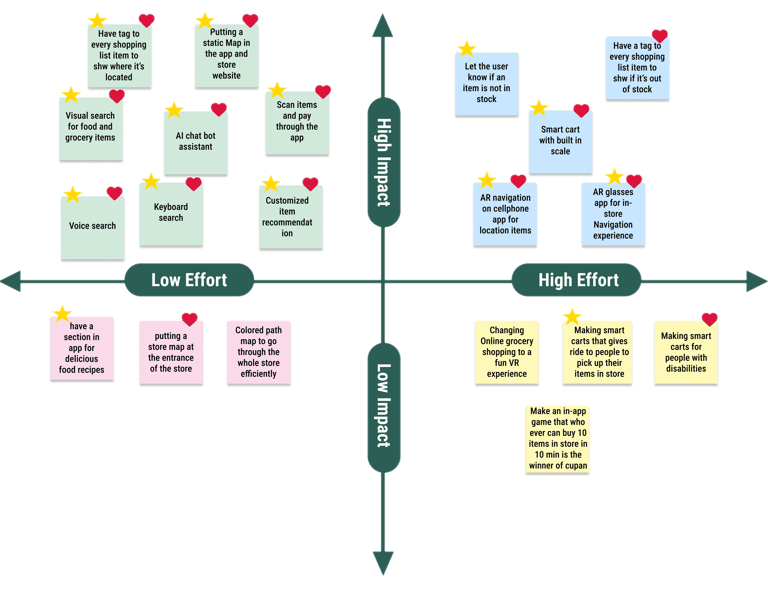
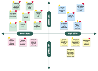
During the brainstorming phase, I began by generating as many ideas as possible to address the challenges identified in the research and answer the "How Might We" questions. To better assess the feasibility of the ideas, I collaborated with a data scientist, an ML engineer, and a hardware engineer to distinguish low-effort from high-effort concepts. Those discussions helped me to categorize the ideas using the Impact vs. Effort matrix, prioritizing those with low effort and high impact—defined by their ability to affect key performance indicators (KPIs) positively and directly address user needs. This structured approach ensured a focus on the most feasible and valuable features for the app.


Brainstorming


To address key user needs, I combined all the proposed solutions into a journey map. This map outlines how users navigate the shopping experience, ensuring that a smooth and successful journey reflects an effective product design. By mapping out the personas' experiences, I identified the benefits of an in-store navigation app—helping users find items faster and streamlining checkout through the app.
User Journey Map
Design
Based on insights from user research and journey mapping, I designed and developed user flows for different app features to show how users interact with various parts. The example below demonstrates how the in-store navigation app helps users quickly locate items, scan them, and check out seamlessly.
User Flow


User task:
Use the in-store navigation app to locate items, scan them, and check out.


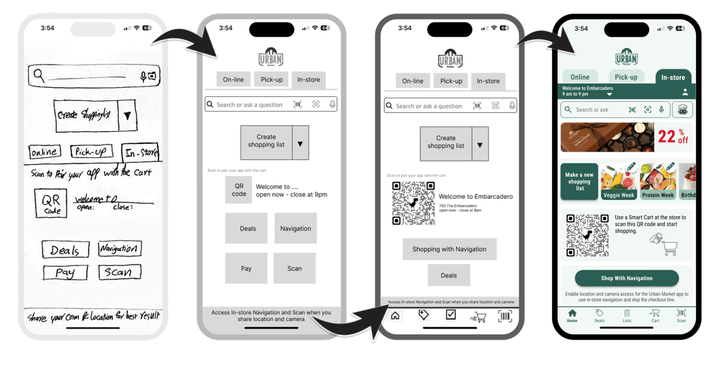
Building on user flows and journey mapping, I developed the Information Architecture and designed wireframes to visualize key screens users would interact with while completing core tasks. This step was essential in translating abstract ideas into intuitive, user-centered designs.
Low - Fidelity Wireframes
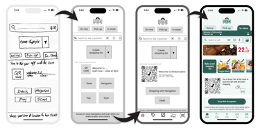
After developing wireframes, I created low-fidelity prototypes to test the core interactions and user flow. The goal was to validate the overall structure and ensure users could navigate key tasks without confusion.


Low - Fidelity Prototype
After each step, I conducted usability tests to uncover areas that needed improvement in clarity and intuitiveness. Based on user feedback, I continuously refined the prototype to create a more seamless and user-friendly experience.
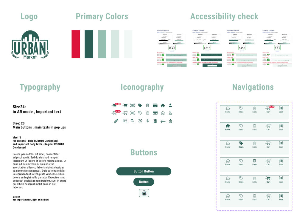
To maintain consistency across the product, I developed a design system that standardized visual elements, components, and interaction patterns. This system ensured that both designers and developers could work efficiently while delivering a cohesive experience to users. The design system included predefined typography styles, ensuring clear and readable content across all screens. I established a color palette that balanced accessibility with brand identity, while reusable UI components like buttons and icons helped streamline the design process.


Design System
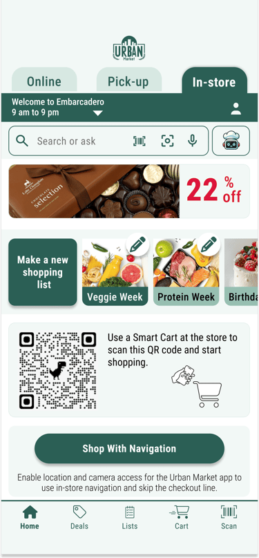
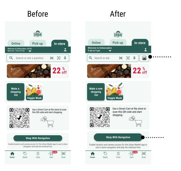
After refining the low-fidelity prototypes based on user feedback, I developed high-fidelity mockups to visually represent the final design. These mockups showcase the product’s layout, typography, color palette, and key interface elements, ensuring a polished and user-friendly look.
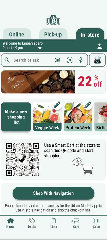
Homepage
Shopping list
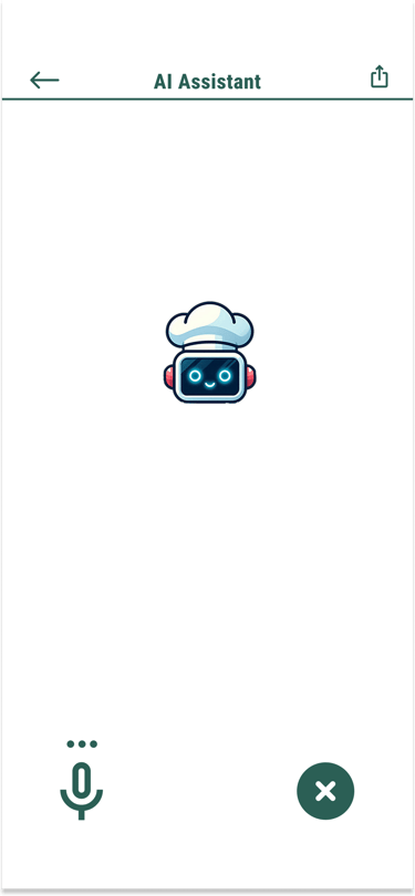
ChefBot voice mode
ChefBot chat mode
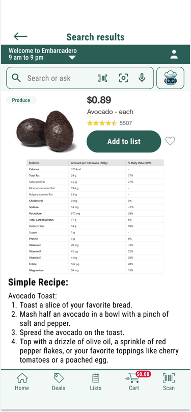
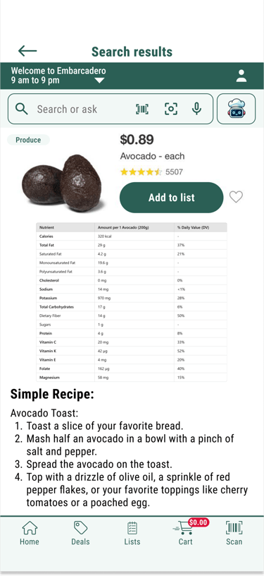
Search result
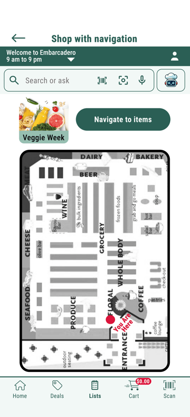
Shop with navigation
In-store navigation
Cart
Mockup Samples


Flow 1: Onboarding User
This flow shows a first-time user opening the in-store app and is guided through an onboarding process that introduces the app's key features. They learn how to create a shopping list, interact with the shopping assistant (ChefBot), pair the app with a smart cart, and use AR navigation on their smartphone to easily locate the items, scan them, and checkout.
Flow 2: Returning User With Unfinished Purchase
This flow shows a returning user who left a few items unpurchased from their previous shopping trip receives a notification upon opening the app. The notification offers the option to add those unpurchased items to their new shopping list or discard them if no longer needed.
Flow 3: Returning User
This flow shows a returning user who successfully completed their previous shopping process.


After finalizing the visual design and structure, I developed a high-fidelity prototype that closely resembles the final product. This prototype simulates real interactions, allowing users and stakeholders to experience the design as it would appear in production. The following shows different user flows and key features of my design.
AR Navigation and Checkout Features
This feature resolves the key challenge of locating items. The AR navigation guide ensures users take the shortest route through the store to pick up all items from their shopping list. Once all items are collected and scanned, users can quickly and seamlessly checkout and pay directly through the app.
I collaborated with ML and hardware engineers through multiple meetings to identify the most cost-effective solution for the AR navigation system, leveraging existing technologies to ensure affordability and feasibility.
Scanning the barcode
Visual search
Conversing to Chefbot
Search Features
These flows demonstrate how users can search for items in various ways: by taking a picture for AI-based shape recognition and visual search, scanning the barcode, or interacting with the AI assistant.
Deals
This flow shows the deals section of the app which becomes more personalized as the user engages with the app. Over time, the app tailors specific deals to individual users based on their preferences and shopping habits. Users can easily add these items to their shopping list with a single tap.
High - Fidelity Prototype
Test and Iteration
I conducted 5 rounds of usability tests at each stage to identify areas that were unclear or lacked intuitiveness in the prototype. Based on users' feedback, I iteratively refined the design to enhance clarity, functionality, and overall user experience. This process ensured that the final solution was both user-centered and effective.


Improved product metrics
Customer Engagement:
• Time spent using the app per store visit.
• Interaction rate with features like product search, deals, or navigation.
• Usage rate of personalized recommendations.Operational Efficiency:
• Reduced time spent finding items (through app navigation).
• Reduced wait times with features like self-checkout or express lane reservations.
• Increased adoption of shopping lists or scan-and-go features.Store Performance:
• Improved traffic flow within the store (via optimized item location guidance).
• Reduction in staff support queries (like item location requests).
Customer Acquisition and Usage:
• App downloads and registrations.
• Percentage of in-store shoppers using the app.Customer Satisfaction and Retention:
• Customer satisfaction (CSAT) with in-store shopping.
• Repeat usage rate (how often users rely on the app).
• NPS scores for app users compared to non-users.Sales and Revenue:
• Increase in average basket size (due to personalized suggestions or promotions).
• Incremental revenue from upselling or cross-selling via the app.
• Increased redemption rate of app-exclusive deals or discounts.
I designed the solutions with specific success criteria in mind, which I categorized into the following 6 categories.
User-Centered Solutions:
Addressed common grocery shopping pain points, such as locating items, long checkout lines, and uncertainty about meal planning, with tailored features like AI assistance, AR navigation, and app-based checkout.
Scalable Design:
Developed solutions that are not only useful for Urban Market customers but also adaptable for other retail businesses, pick-up services employers and other shopping services like Instacart shoppers.
Innovation in Shopping:
Introduced advanced technologies like AI and AR to create a seamless and enjoyable shopping experience, including integration with AR glasses for a futuristic edge.
Efficient Collaboration:
Collaborated with engineers to identify cost-effective, existing technologies for implementation, ensuring feasibility and affordability.
Accessibility and Inclusivity:
Designed with accessibility in mind, such as enhanced color contrast for visually impaired users.
Iterative Design Process:
Conducted usability testing after each iteration to refine features and ensure clarity and intuitiveness for end users.