UI | UX | Product Designer
Concept Project


Concept Project


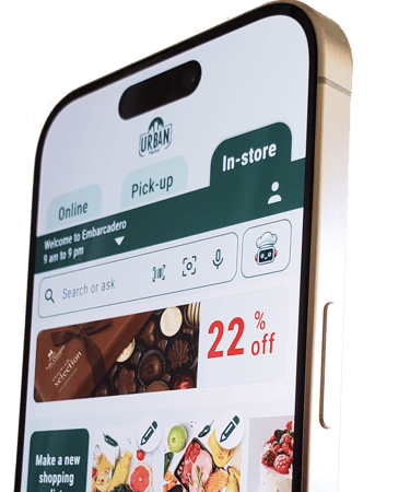


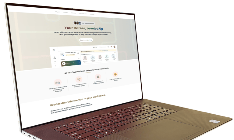
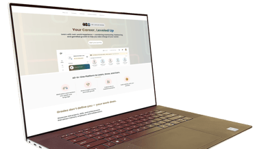
LevelUp: A B2B2C SaaS Social platform connecting education and industry
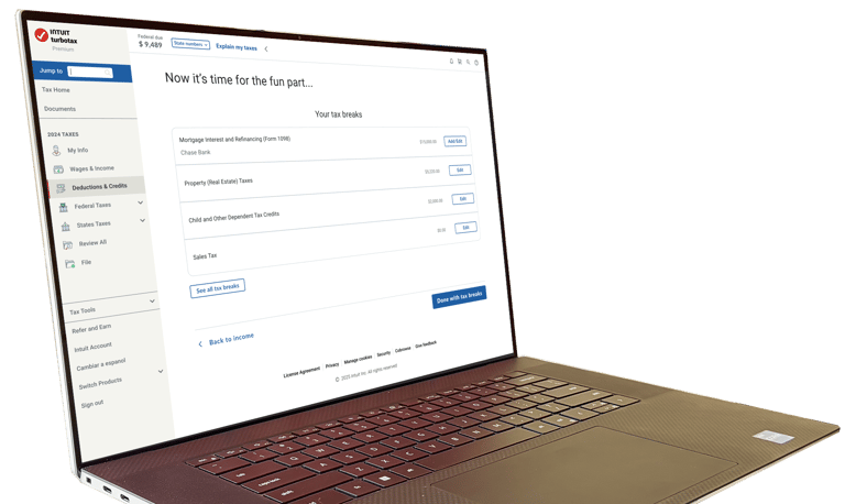
Under NDA


Concept Project


Concept Project


Elham Sepehrjou
Let's make a UXciting future!
UI | UX | Product Designer
UI | UX | Product Designer
Concept Project
Concept Project
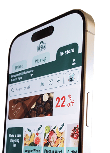
LevelUp: A B2B2C SaaS Social platform connecting education and industry
Under NDA
Concept Project
Concept Project
UI | UX | Product Designer